Data Management and Capacity Building
Data Management for Federal and State Funded Programs
For nearly three decades, Edstar Analytics has managed the data and given digestible analysis for many state and federally funded programs. We can create custom data-management systems for keeping records for grant-funded programs. They will be easy to use and capture the data needed. Our systems will capture data in ways that also facilitate fiscal accountability for grant funds.
Making Data Easy to Understand
We produce technical reports required for accountability to funders and also provide infographics and dashboards to be used by program staff for decision making and for reporting to stakeholders. We create presentations for our clients to use to communicate results to their stakeholders, and at professional conferences.
Making Data Easy to Manage
We understand the different perspective of stakeholders regarding data. Some staff need individual records, while others need all the data electronically, so it can be monitored and summarized for reporting. We create custom online forms that serve the unique needs of all stakeholders. Click here to see an example of a form that would provide teachers with artifact documents to show how activities align with the NC Professional Teaching Standards, while creating a database that captures the input. We use this resource when evaluating grants so that we can document how teachers perceive capacity-building activities in terms of these standards.
Interactive Dashboard
The following example is one of Edstar Analytic’s interactive dashboards. Use the pull-down menus of the school district and numbers/percents to see the graphic display of their Read to Achieve Results. These are all driven by the publicly-available entries on the data tab.
Data Academies and Tools for Understanding
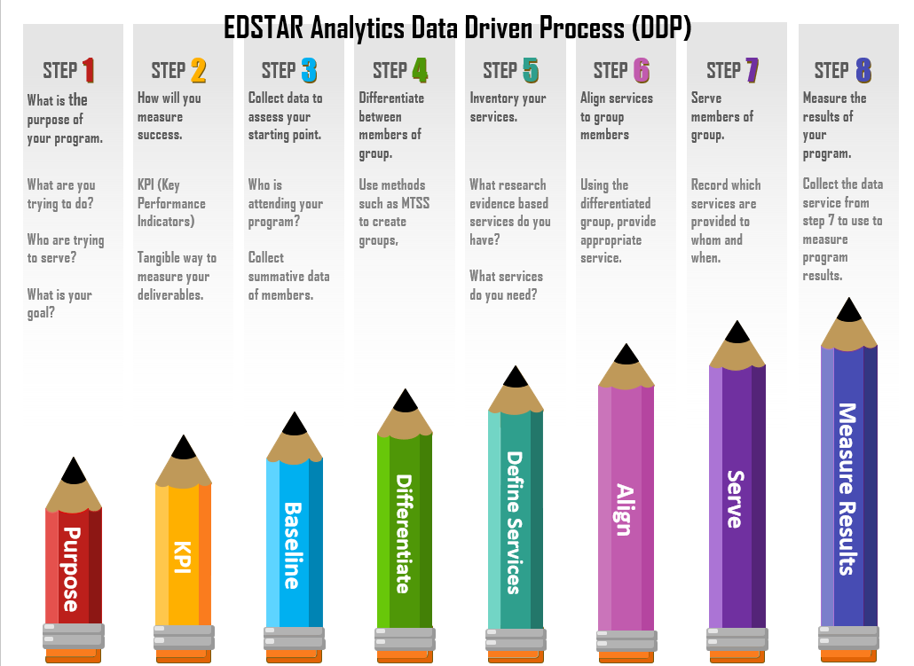
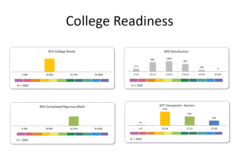
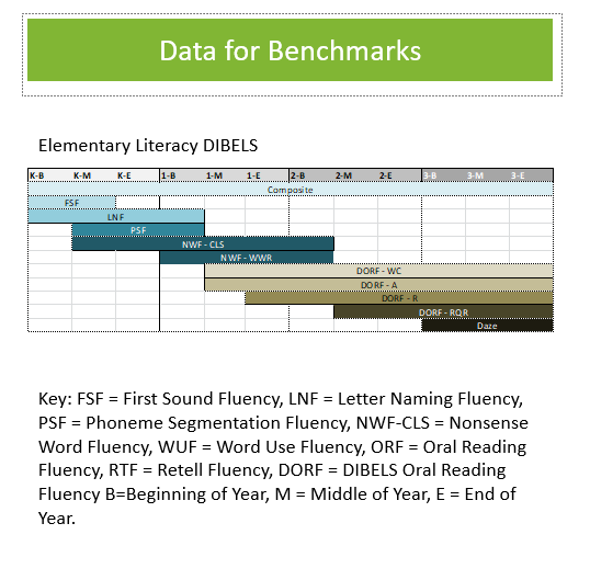
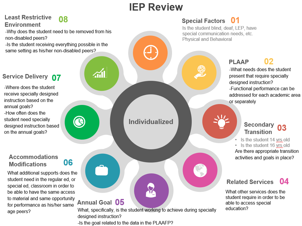
Edstar Analytics has been helping school staff write School Improvement Plans, use American School Counselor Association National Model, and use data-driven goals for grant-funded programs for decades. We have created tools to help educators more effectively use data. We color-code data to help with interpreting it and using it to align services for students. Our four colors denote the range from Needs Significant Help (pink) to Needs Rigor and Access Support (Blue). Click here to see the tool we use for recommending and interpreting relevant data.
We provide interactive tools to help educators understand the information. We call the following the Tower of Hope. Changing the numbers in the table produces a new Tower of Hope to illustrate the distribution of resource need.
%
Decrease dropout rates
%
Increase in math 1 achievement
%
Decrease in absenteeism
%
Reduced Achievement Gap


